The Ultimate Guide to Social Media Branding
Social Media Branding is arguably the BEST part of social media. I know I’m a nerd when it comes to this but it’s because I know how effective social media can be for your business. I mean, if you want a brand that people want to engage with, a community of loyal fans, and of course, a business people want to buy from…Social Media Branding can make the biggest impact for your business.
Branding is really all about defining the message and brand you’re putting out in the world. This is the lead attraction stage – the most important part of your sales funnel! If you’re interested in making this a long lasting relationship, you’ll take the steps outlined below to make the best first impression you can make.
The reason social branding plays such a critical role in lead attraction is because this is what you put out into the world to draw people in. It puts people in to the top of your sales funnel where you can then continue your relationship to the sales process.
Think of it like going on a date, you want to dress up and look your best, right? (I hope!) This first impression – your first interaction with eachother is going to determine whether you see eachother again. So if you DO want to see your social media or website visitors again – you’ll want to nail this first impression.
And, since everything is connected: your facebook links to your website, your website links to your twitter, your twitter links to your website, which links to your products, which link to your pinterest – it’s a full circle and you have to take the time to design a cohesive social brand, and I’m going to show you how.
Social Media Branding has been a game changer for my business. I’ve used social media to grow businesses for the last 6 years and it wasn’t until I implemented these exact strategies that I’m about to share with you, where I started seeing results. And I mean, results = profits, clients, + sales.
When it comes to social media branding – there is a lot to define:
- Who You Are? – Brand Definition
- Who Do You Help? – Target Market
- What Do You Share? – Content
- Brand Design – Visual Elements
Most of this was covered in detail in this post so today we are going to dig even deeper and get into how you make that brand definition work FOR you. Yeah babe!
(Need more help defining your brand? The Social Media Digital Bundle will walk you through this)
Besides your website (obviously) and having a logo – there’s a whole list of items you will want to brand on social media. (Free Branding checklist for you, here)
If you want to be amongst the best brands, you have to act like one of the best brands. You have to take the time to get these elements right so you are perceived favorably by fans.
Think about it:
- Apple puts their logo on everrrrything. We instantly know an apple product just with their logo – no text required.
- Amazon puts their logo and smile on every single box they send out. People know immediately when they receive a box from Amazon.
- Coca-Cola – I mean…it’s only the most recognized brand in the world!
What do all of these have in common? Besides huge marketing budgets – they have instant brand recognition!!
The more people are familiar with your brand, the more they know and trust you. THAT is what we’re going for with visual branding.
Let’s get this party started!
First – let’s set the foundation with the 5 Branding Elements.
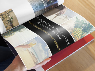
You are going to combine these 5 elements to create YOUR unique brand:
Logos | Colors | Fonts | Style | Themes
Are you excited, or what?
Element 1 – Logo:
This is something that is reflective of you, your business, and your style. If you already have a logo – awesome! You can use your logo and create your branding around that since it’s an established brand asset you already have.
Element 2 – Colors:
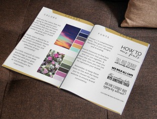
Choose 1-3 colors. If you’re starting a brand from scratch, do some color research to find out what you’re looking to display with your brand.
For example: the color black is “powerful, sleek, and used to market luxury” whereas blue is “Peace, Calming, & Kindness”
Here’s a handy color chart I found here that may help you.
Now, if you’re already have a website and a logo – you can pull 1-3 colors from them to integrate seamlessly into your branding which will create that cohesive presence online.
Element 3 – Fonts:
Choose 1 -2 complimentary fonts for your branding. These will be consistent amongst your social media accounts and your website. There are amazing font pairing examples on Pinterest if you need some inspiration.
Element 4 – Image Style:
This is your image style. You want to choose a consistent image style that is representative of your brand. This can really help make a difference amongst the sea of competition.
What to do: If you’re a beachy company, you can choose beachy images (simple right?) You know that’s what your ideal customers are interested in and you can use them to represent your brand.
What not to do: If you’re a beachy company, you use pictures of the jungle. Obviously…there’s a disconnect here and it would really throw people off.
Take some time to research the types of images you want to use to brand your biz.
A few resources to find images:
- Pixabay (Free)
- Kaboompics (Free)
- Canva ($1)
- Creative Market (TONS of Styled Stock Photography + More) ($-$$)
- Fotolia ($)
- Stocksy (Gorgeous – Exclusive Photos) ($-$$)
Element 5 – Image Themes:
This is where you make your images unique! You’ll add your logo, your styles, font, overlays, filters, borders, unique elements that represent your brand. This is where you will set your biz up for massive brand awareness.
Now that you know what you need to establish your unique brand, you can create templates so it’s easy to create these images and share them on social media.
Let’s review how your brand will be pieced together on social media.
Starting with your Facebook page.
- Your Profile Picture – This should be the same picture you use for all of your social networks and your website. This could be a picture of a product, a logo, or yourself – depending on your business.
Use an image that looks good square – the image will size down 160 x 160.
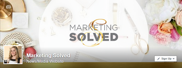
- Cover Photo – This should have your colors, fonts, and your logo to represent your brand. Here’s a quick tutorial showing you how to maximize your cover photo. The size should be 851 x 315.
We’ve used our images style of stock photography with our Marketing Solved logo.
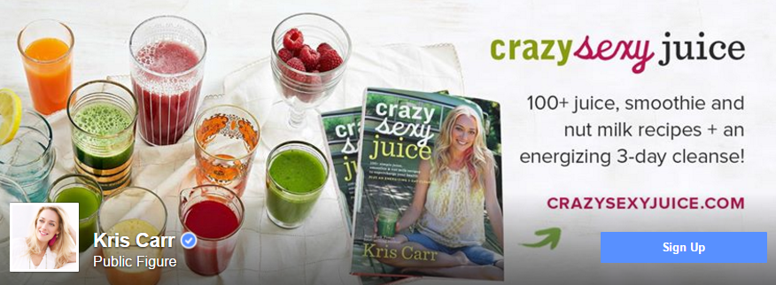
Here’s Kris Carr who uses her cover photo to brand her business while promoting her newly released juicing book.
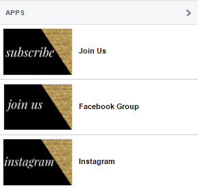
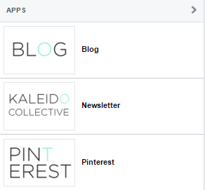
- Facebook Apps – These are brilliant add on’s for your page. You can customize the images to match your brand and link to your social networks, website, or email list. Here’s a 3 minute video that shows you how to install these. The sizes are 111 x 74.
Marketing Solved – We went with our classic black and gold.
Kaleidoscope Blog, used her brand color & fonts for a simple design.
- Blog Posts – You’ll want your blog posts to reflect your branding, there’s a lot of flexibility in how you do this.
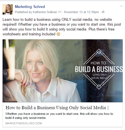
For example, I use the same images that I do as my blog graphics.
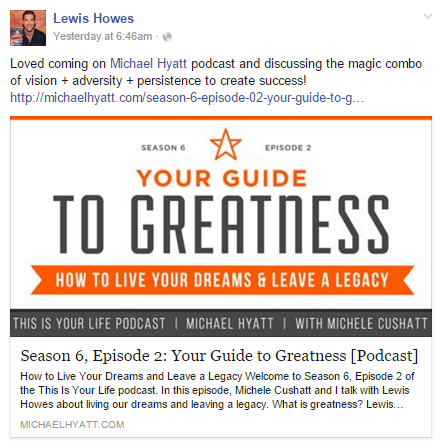
Lewis Howes uses his signature brand colors and simple style to reflect his brand.
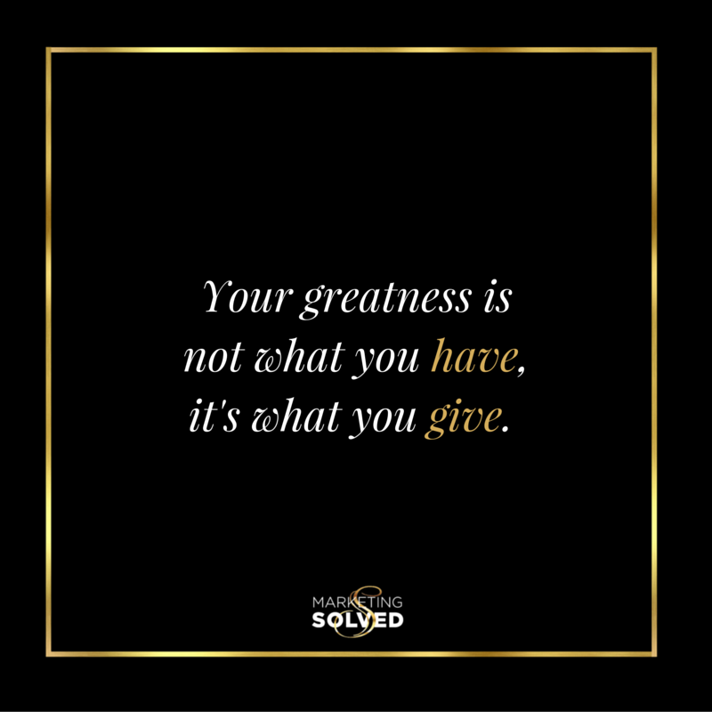
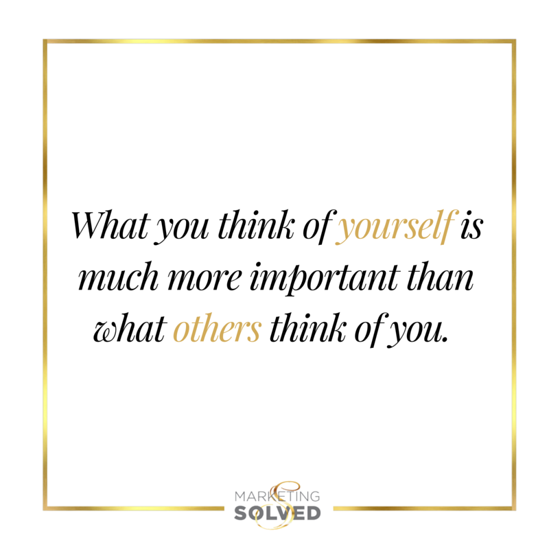
- Social Media Quoteable Images – Again, there’s a lot of flexibility here but these will be sharable across all of your social media platforms so templates will be crucial to save you precious time. (These quotables are also sized and branded perfectly for Instagram – BONUS: TIME SAVER!
We have a few styles here at Marketing Solved but they all have the gold square and Marketing Solved logo at the bottom. We use either white, black, or an image for a background and alternate between 3 different fonts.
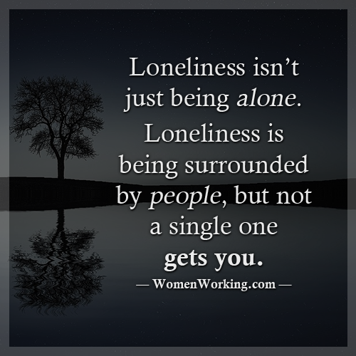
Womenworking adds a dark overlay on their images and adds their website url at the bottom of each quoteable.
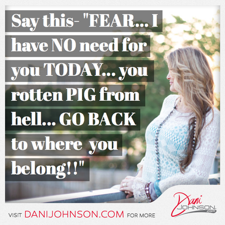
Dani Johnson uses a few different templates to embed images on. The templates have a border which brands her logo and website URL. This is a clever way to have flexibility with your images while keeping consistent branding through the template border.
Moving on to Twitter, we’re looking at mostly the same elements, but we want to format them specifically to this social network.
- Profile image should be the same you’re using to brand your biz. Go with a square image that will shrink down to 400 x 400.
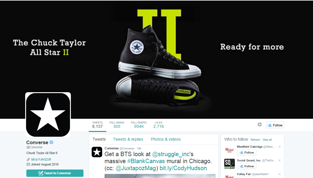
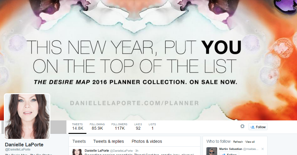
- Header Photo – This is a HUGE piece of real estate so use it wisely. Brand your business, promote a new product, or add a call to action for people to sign up to your email list. The size is 1500 x 500 (woah!)
Converse – Simple yet strong branding. Instantly recognizable with their most popular shoe.
Danielle LaPorte – Uses her brand colors, brand fonts, adds her website on the bottom, and used the space to promote a product.
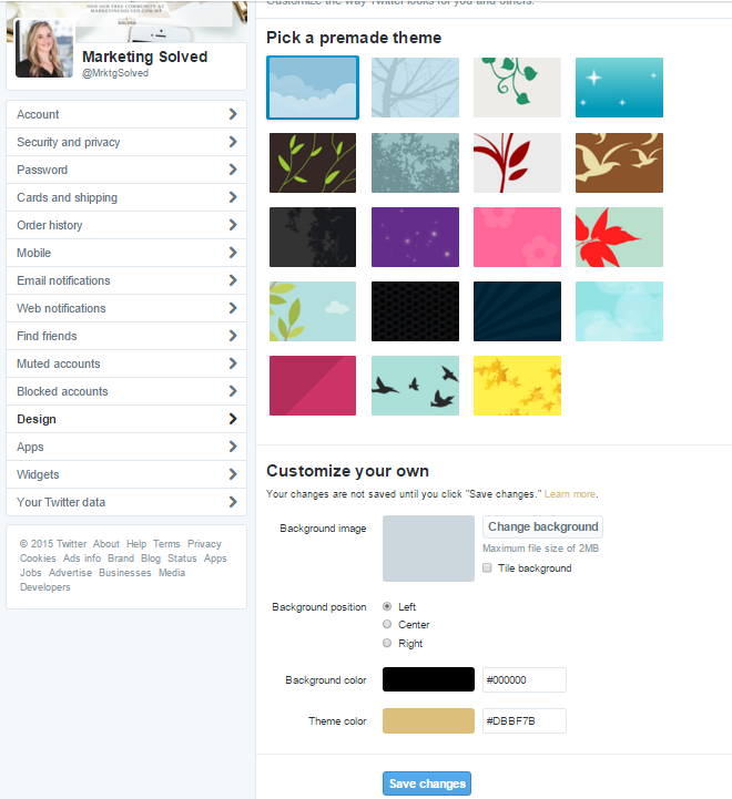
- Profile Theme – This is an awesome tool you can use to reinforce your branding on Twitter. In your account, go to Twitter.com/settings/design and you’ll see a screen like this.
Look at all these options! You can upload a custom background image or even use a solid color. You can then select a “Theme Color” to match your brand. You can see how I’ve selected to use the “Gold/Black” brand to represent Marketing Solved. This is the color of elements your visitors will see – reinforcing brand familiarity.
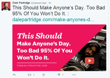
- Blog Posts – Images on Twitter outperform tweets without images. Just like on Facebook, you should use this feature to add custom Twitter friendly images to your tweets. Image Size 880 x 440.
Dale Partridge is brilliant at this. These are custom sized for Twitter, eye catching, and are the same style templates he uses for Facebook, Pinterest, and his blog.
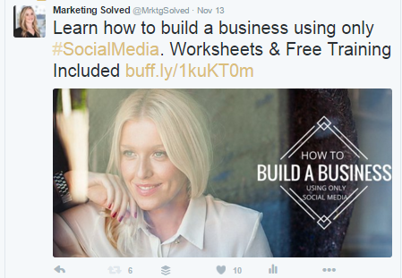
Here’s Marketing Solved – You can see how we keep the branding consistent with blog graphics amongst all of the networks.
- Quoteables, these can match your template or branding, ideal size is 880 x 440.
Now, let’s peek at Pinterest. Pinterest has quickly become one of my favorite social networks for business.
- Your Profile – Are you seeing a theme? Yes, your profile must be consistent everywhere! This shrinks down to 165 x 165.
- Board Covers – This is where you can really make an impact. You can create custom board covers and they can really set you apart and attract your ideal clients!
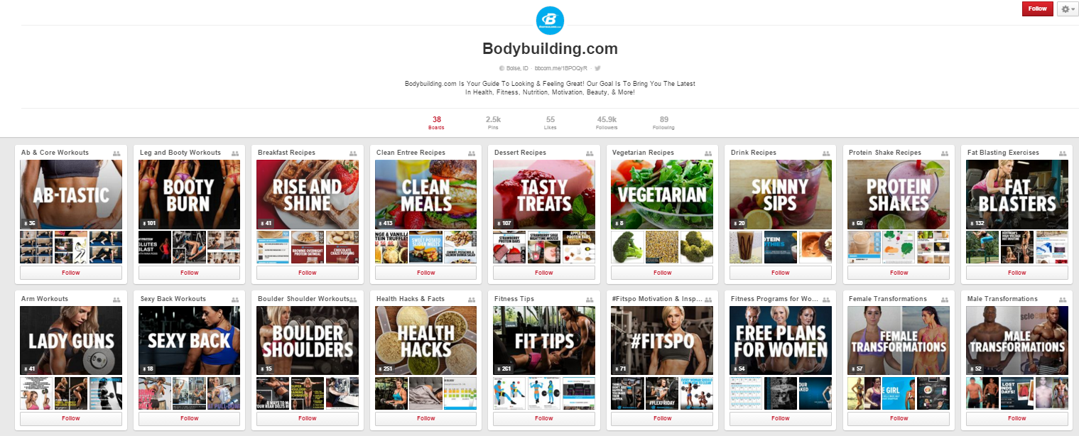
Bodybulding.com – They’ve used a consistent image style and font type / size for their board covers.
Here’s a different way you could brand your boards, use your image style. Apartment 34 chose boards covers that are white, clean, and simple.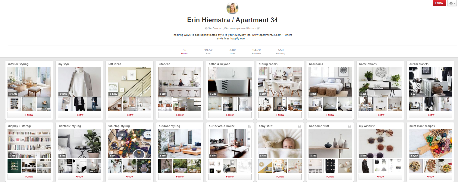
- Pin Images – These are the graphics that you want to link back to your website. They can be uploaded directly to Pinterest, or they can be graphics you add to your blog to make it easy for others to pin your content. (Option B is the way to go!) They can vary in size but tall pins outperform short pins. A good size would be 735 x 1102.
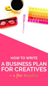
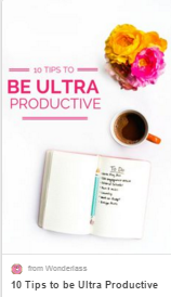
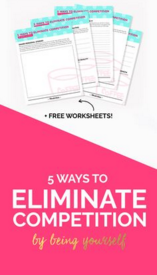
Wonderlass does an excellent job of using a variety of styles but keeping a consistent theme with font style and colors.
Finally, let’s peek at Instagram.
Do I even need to say it? Start with your…
- Profile Photo! I know, I know. This will shrink down to 110 x 110.
- Images – These can be square or rectangle. Ideal size is 1080 x 1080 and can go up to 1350 high.
- Your Feed – Get CREATIVE! There are so many ways to stand out on Instagram and because it’s primarily visual, you can integrate your brand in every. single. image.
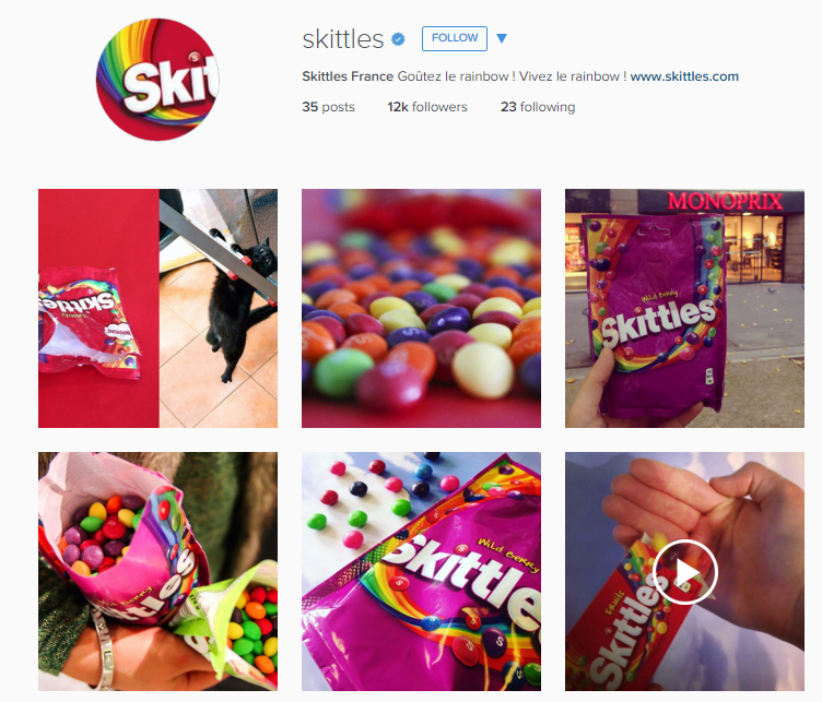
Look at how Skittles uses their feed – Can’t you just taste the rainbow? They really make it all about their product!
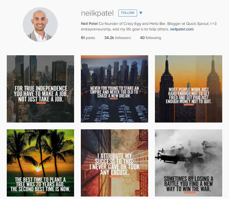
Neil Patel uses branded quoteables for his feed. The image styles, overlays, filters, and fonts are all similar and create a really eye catching brand.
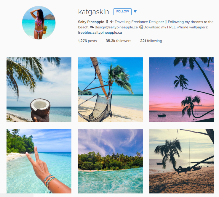
This is one of my favorite Instagram accounts ever: Kat Gaskin, and no, not because her name is Kat (although we KNOW all Kat’s are pretty awesome, right? ) She shares a tropical theme, beach style, pastels images and filters, and focuses on the theme and style of her images. Each image comes together to support a larger purpose of the brand.
Nice work!
